
Humanity Research Consultancy
Humanity Research Consultancy
Humanity Research Consultancy
How we increased the conversion rate and the accessibility of the website.

Client
Client
Client
Humanity Research Consultancy
Humanity Research Consultancy
role
role
Product Designer
Product Designer
Type
Type
Type
Website Redesigning
Website Redesigning
Timeline
Timeline
Timeline
Dec 2023-Apr 2024
Dec 2023-Apr 2024
Tasks
Tasks
Tasks
User research, Competitive Analysis, Affinity Map, Personas, User Flow, usability testing, A/B Test
User research, Competitive Analysis, Affinity Map, Personas, User Flow, usability testing, A/B Test
TEAm
TEAm
TEAm
1 Project Manager, 1 Developer and 1 Product Designer
1 Project Manager, 1 Developer and 1 Product Designer
Overview
Overview
Humanity Research Consultancy (HRC) is a UK-based social enterprise dedicated to combating modern slavery and human trafficking.
HRC aims for their website to achieve two main objectives:
Convert website visitors into HRC clients.
Provide easy access for clients to locate HRC’s publications.
However, HRC's existing website failed to meet these goals.
In redesigning HRC’s website, my focus was on optimizing the user experience for these two critical processes.
What was wrong with the old website?
What was wrong with the old website?

What did the stakeholders think?
What did the stakeholders think?
Before diving into the project, I wanted to understand the frustrations my stakeholders had with their old website and what they hoped to achieve with the new one, so I arranged a meeting with them.
Before diving into the project, I wanted to understand the frustrations my stakeholders had with their old website and what they hoped to achieve with the new one, so I arranged a meeting with them.
The website wasn't bringing in new clients for us.
The website wasn't bringing in new clients for us.
HRC aims for their website to serve as a touchpoint for reaching potential clients and converting them into actual clients; however, their old website fell short of this goal.
HRC aims for their website to serve as a touchpoint for reaching potential clients and converting them into actual clients; however, their old website fell short of this goal.
HRC aims for their website to serve as a touchpoint for reaching potential clients and converting them into actual clients; however, their old website fell short of this goal.

Users were barely aware that HRC also provides services for the private sector.
Users were barely aware that HRC also provides services for the private sector.
HRC is serving NGOs, private sectors, and governments. Even after visiting their website, users remained largely unaware that HRC offers services for the private sector.
HRC is serving NGOs, private sectors, and governments. Even after visiting their website, users remained largely unaware that HRC offers services for the private sector.

Our publications should be accessible to users from diverse language backgrounds.
Our publications should be accessible to users from diverse language backgrounds.
HRC targets clients globally and from various language backgrounds. That's why they offer many of their publications in multiple languages and are keeping this identity in mind for the new website.
HRC targets clients globally and from various language backgrounds. That's why they offer many of their publications in multiple languages and are keeping this identity in mind for the new website.

What did the users think?
What did the users think?
Since HRC's website caters to both current and potential clients, I conducted interviews with nine individuals, including current clients of HRC as well as individuals from various backgrounds. I prioritized feedback that aligns with business objectives and is easily resolved.
Since HRC's website caters to both current and potential clients, I conducted interviews with nine individuals, including current clients of HRC as well as individuals from various backgrounds. I prioritized feedback that aligns with business objectives and is easily resolved.


After prioritizing the feedback, I examined the situations users encountered and attempted to identify the challenges they faced.
After prioritizing the feedback, I examined the situations users encountered and attempted to identify the challenges they faced.
If I want to hire them for training and research, where should I reach them?
If I want to hire them for training and research, where should I reach them?


Where can I find services related to my industry?
Where can I find services related to my industry?


It’s hard to find specific publications.
It’s hard to find specific publications.
“In the publication sector, many of the cover photos are the same. It’s making it difficult for me to find the publication I’m looking for.” —Nolan, a current client of HRC
“In the publication sector, many of the cover photos are the same. It’s making it difficult for me to find the publication I’m looking for.” —Nolan, a current client of HRC


How could we assist different user groups?
How could we assist different user groups?
Based on the interviews, I found that users fall into two categories:
Based on the interviews, I found that users fall into two categories:


how did we solve these issues?
how did we solve these issues?
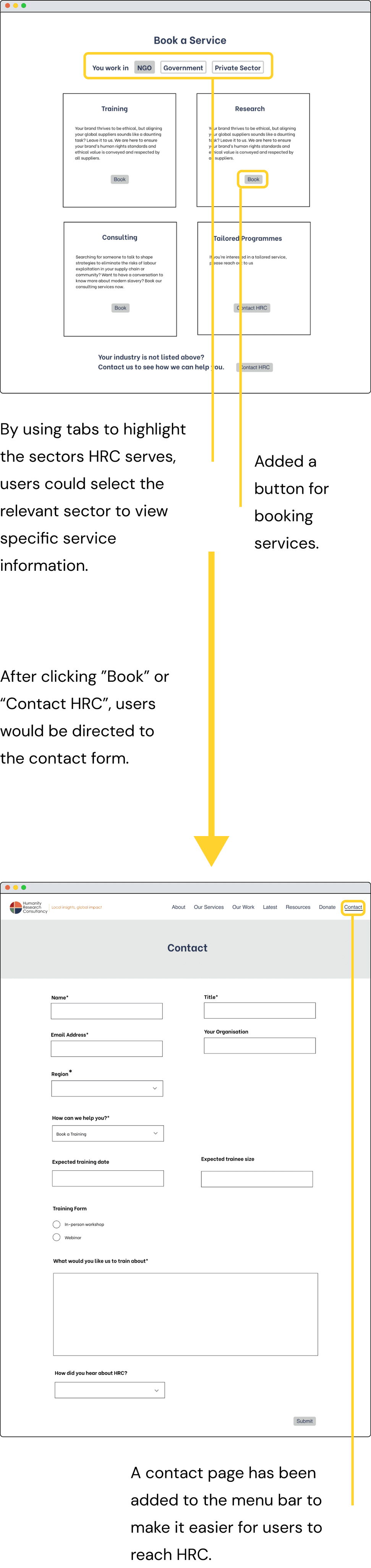
Finding a better way to showcase services for clients across various sectors
Finding a better way to showcase services for clients across various sectors
How did other websites tackle similar problems?
How did other websites tackle similar problems?
HRC’s competitors, the Mekong Club and Loning Academy, used tabs and accordions to showcase services for different sectors.
Although their designs varied, the goal was the same: to avoid overwhelming users with too much information. They displayed all sectors upfront, allowing users to easily navigate and view information relevant to each sector.


Implemented findings in the mid-fidelity wireframes
Implemented findings in the mid-fidelity wireframes

Finding a better way to showcase publications of different language versions
Finding a better way to showcase publications of different language versions
Designed for stakeholder needs: Anticipate future requirements
Designed for stakeholder needs: Anticipate future requirements
For the old website, each language version of a publication had its own page in the corresponding language. In my redesign, I brought different language versions of content and publications together on a single page.
HRC was considering switching the whole website to multilingual using a translation tool. So, I created a design that could easily adapt if we decided to go with that solution.


2.

Behind the scene: Why did we use the Taiwanese flag for Mandarin?
Behind the scene: Why did we use the Taiwanese flag for Mandarin?
On most websites, Mandarin is typically represented by the Chinese flag, but on HRC's website, we've opted for the Taiwanese flag instead.
I'm a product designer who focuses on accessibility, and I'm also a proud Taiwanese, as is Mina, the founder and director of HRC. We've considered that some visitors might not immediately associate the Taiwanese flag with Mandarin, but we're ready to embrace that risk. It's our way of showing a bit of rebellion as two proud Taiwanese.
To the future recruiters: Don't worry, I won’t make any rebellious moves without consulting you when we work together. Accessibility remains a top priority!
Did the new design solve the problems?
Did the new design solve the problems?
What were the problems we solved?
What were the problems we solved?
To confirm that the new design effectively addressed the issues of the old website, I conducted usability tests with five users. Here are the problems we resolved:
To confirm that the new design effectively addressed the issues of the old website, I conducted usability tests with five users. Here are the problems we resolved:
Improved the service booking journey
Improved the service booking journey
All users (100%) recognized that HRC serves clients from NGOs, government, and private sectors.
80% of users successfully navigated to the relevant sector, accessed specific service information, and made a booking.
All users (100%) recognized that HRC serves clients from NGOs, government, and private sectors.
80% of users successfully navigated to the relevant sector, accessed specific service information, and made a booking.


Improved the display of multilingual publications
Improved the display of multilingual publications
All users understood that the flags indicate multilingual versions.
80% associated the flags with each publication having a page in the corresponding language, while the remaining 20% linked the flags to the language versions of the publications.
All users understood that the flags indicate multilingual versions.
80% associated the flags with each publication having a page in the corresponding language, while the remaining 20% linked the flags to the language versions of the publications.


What was the new problem we faced?
What was the new problem we faced?
The differences between the two language selection features were not easily recognizable.
The differences between the two language selection features were not easily recognizable.
80% of users were confused by the two language selection features in the new design. They were thinking both do the same thing: changing the content on the page to the selected language.
“I guess the language selection feature at the top means using Google Translate to translate the page, while the one at the bottom also means that the language on the page will be translated?” —Justin


What's the best way to make users aware that the two language selection features serve separate functions, with one switching the page language, and the other opening a publication file in the selected language?
What's the best way to make users aware that the two language selection features serve separate functions, with one switching the page language, and the other opening a publication file in the selected language?
Balancing user and stakeholder needs
To explore ways to make the distinctions between the two language selection features more apparent, I conducted A/B tests with five users.
To explore ways to make the distinctions between the two language selection features more apparent, I conducted A/B tests with five users.


Users all chose Option A as the clearer choice. They knew that clicking on a language button below would download a PDF file, and they were aware of the file size beforehand.
Option B, while less clear than Option A, is still understood by users as opening the publication as a PDF file.
However, the stakeholders preferred Option B. They suggested that clicking a language button should open a PDF file "in a new tab" rather than downloading it.
Considering both user and stakeholder needs, I decided on Option B. Despite users finding it slightly less clear than Option A, it avoids confusion and satisfies stakeholder requirements.
Refreshing the old website's appearance
Refreshing the old website's appearance
Stakeholders' views on the old website design
Stakeholders' views on the old website design
The stakeholders thought the old website design was inconsistent. They disliked the grey background, and thought there were too many font sizes.
The stakeholders thought the old website design was inconsistent. They disliked the grey background, and thought there were too many font sizes.


Stakeholders wishes for the new website
Stakeholders wishes for the new website
The stakeholders wanted the new website to be simple, elegant, and professional, with a clean and attractive design. A key constraint was that the site should not use excessive colors or blocks to separate sections. I experimented with various styles to determine their preferences.
The stakeholders wanted the new website to be simple, elegant, and professional, with a clean and attractive design. A key constraint was that the site should not use excessive colors or blocks to separate sections. I experimented with various styles to determine their preferences.


How to make a text-heavy website more visually appealing?
How to make a text-heavy website more visually appealing?
In the website redesign, I enhanced visual appeal by adding more photos and a dynamic layout that combined images and text for a lively look.
To tackle the problem of text overload, I implemented carousels and pop-up windows, making detailed information accessible without overwhelming the main content.


Final prototype
Final prototype
Desktop version
Desktop version
Mobile version
Mobile version
During the redesign, my focus was on creating modular elements that seamlessly adapt to both mobile and desktop environments, ensuring a uniform and engaging user experience across all devices.
During the redesign, my focus was on creating modular elements that seamlessly adapt to both mobile and desktop environments, ensuring a uniform and engaging user experience across all devices.
Stakeholder’s and users’ views on the new website design
Stakeholder’s and users’ views on the new website design
Stakeholder
Stakeholder
"We wanted to make a new website that was user friendly, presenting our work in a clear manner. Afore went above and beyond to make this a reality. Working with Afore was stress-free thanks to her professionalism and close attention to detail. She ensured each aspect of the design was not only beautiful, but also in line with the improvements we wanted to make with our new website." —Valentina, former Head of Operations at HRC
"We wanted to make a new website that was user friendly, presenting our work in a clear manner. Afore went above and beyond to make this a reality. Working with Afore was stress-free thanks to her professionalism and close attention to detail. She ensured each aspect of the design was not only beautiful, but also in line with the improvements we wanted to make with our new website." —Valentina, former Head of Operations at HRC
Users
Users
“The new website definitely looks nicer compared with the old one.” —John, a current client of HRC
“The website is very intuitive to use, and there have been significant improvements in its visual presentation and user interface.” —Guan-Yu, a potential client
"The general process, color selection, and visual hierarchy are all good.” —Helen, a potential client
“The design looks clean and professional.” —Pei-Tseng, a potential client
To be continued
To be continued
Is the new website really bringing in more clients for HRC?
Is the new website really bringing in more clients for HRC?
Although both stakeholders and users appreciate the new look and improved functionality of the website, we will need to wait a few months after its launch to determine if it is indeed attracting new clients for HRC. The new website, launched on June 25th, 2024, is currently collecting data on the number of new clients contacting HRC through the site.
Although both stakeholders and users appreciate the new look and improved functionality of the website, we will need to wait a few months after its launch to determine if it is indeed attracting new clients for HRC. The new website, launched on June 25th, 2024, is currently collecting data on the number of new clients contacting HRC through the site.
Thinking in both the stakeholders' and users' shoes
Thinking in both the stakeholders' and users' shoes
Ideally, to enhance accessibility for users from diverse linguistic backgrounds, the entire website would utilize a language translation tool to ensure a consistent experience.
However, due to budget constraints and concerns about AI translation quality, the client opted to translate only key pages initially. They planned to evaluate the tool's effectiveness after launch before deciding on further implementation or discontinuation.
As a product designer, I advocated for consistent use of the translation tool but designed the site to be adaptable, respecting stakeholders' concerns.
Now I’m excited to see how the website will go from here!
Other projects
Other projects
informed Copilot: Your AI-Powered Writing Assistant
informed Copilot: Your AI-Powered Writing Assistant
informed Copilot: Your AI-Powered Writing Assistant
Redesigning the product to enhance the Gen AI experience.
Redesigning the product to enhance the Gen AI experience.
